
Behind the scenes of JPW’s rebrand

By LESLIE SPRING
The adage about a cobbler's daughter not having shoes used to ring true for us. When you are busy working on clients’ projects, it’s hard to justify allocating time and resources to your own efforts. Well, we recently did just that.
Consider JPW to be the proud owner of a brand-new pair of shoes.
We made the concerted effort to apply our team’s marketing, branding, design and storytelling skills to JPW. After this process, we not only have a shiny new brand, but we also have a better understanding of who we are and the value we bring to clients. This newfound self-awareness is not altogether unique to us. As our founder and CEO, Jenny Windle, often puts it, “You never know where a rebranding exercise will lead.” For us, it was a place of reflection and rejuvenation.
With enthusiasm, we jumped into this project, and simultaneously revisited our mission, vision and values to make certain that our new brand is congruent with our agency’s newly minted 10-year strategic plan. In short, we evaluated everything – from top to bottom, color palettes to positioning statements – with fresh eyes.
Here’s a peek behind the curtain about our brand evolution.
Streamlined and sophisticated logo: Early in the process, we decided that we wanted to keep our logo as-is with one noticeable evolution: we dropped the wordmark “JPW Communications” and opted to use the monogram solo. This provides us with a more vertical orientation and streamlines the mark. It also makes our logo more versatile and elevates it to a new level of simplified sophistication.
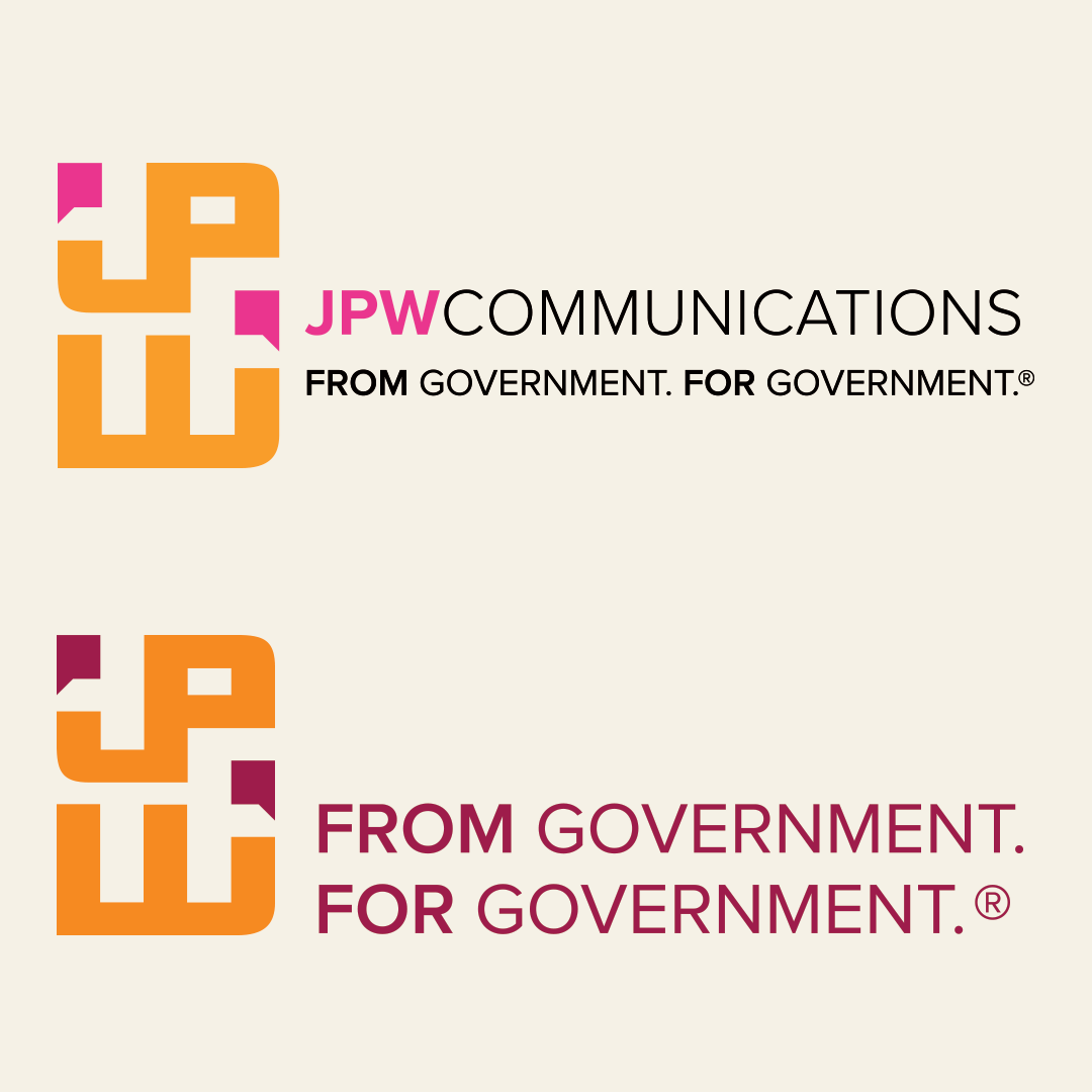
Refreshed color palette: Our new color scheme introduces earthy tones and adds more masculine tones to our existing palette. The pink and orange colors remain, as they have historical meaning for us, but we are considering them secondary accent colors now.
* Our new primary colors are vibrant shades of maroon and a fern green to provide fresh balance to our color palette. We also opted for using ivory as our background color, in lieu of traditional white, to complement our brand.
* Our pink is the shade of the San Diego varietal of the bougainvillea plant, a nod to our company headquarters location. Similarly, the poppy orange color is a nod to California's state flower and poppy fields of the Antelope Valley, where our founder cut her teeth as a PIO with the City of Palmdale.

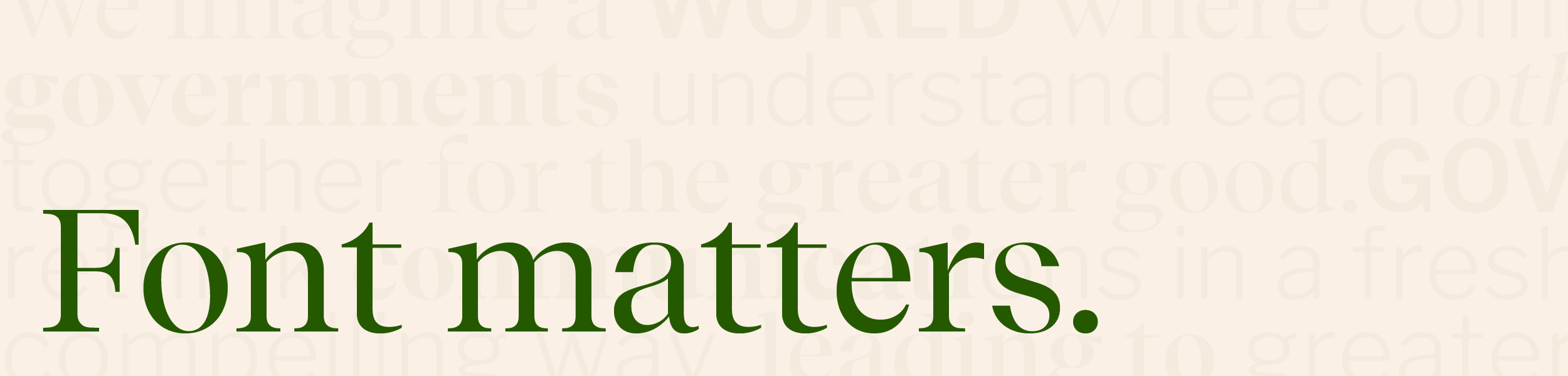
A special font: We are self-proclaimed font enthusiasts, and more than a few of have strong opinions about them. (Comic sans need not apply.) To satisfy our love of fonts, we took this part of the exercise very seriously. We opted for a custom font that harkens to the serif fonts from our newspaper days, but has a modern, distinctive feel. We might be a little obsessed with it. With its classic forms, thin stroke lines, and interesting serif tails and feet, we think it exemplifies us well.
Text-forward design: And speaking of fonts, we love our new one so much that we are leaning into it as a prominent element of our overall brand design. With bold headlines and typographically centered designs, many of our new collateral pieces emphasize short, punchy slugs with our monogram serving as a minimalistic anchor for everything.

Custom layered graphics: Icons can be tough. While they certainly have a time and place, they can all start looking the same, and we wanted to create something a more personalized for us. We also had a hard time identifying singular icons to sum up what we do since every client and project is different. So, we decided to create our own. To accompany our newspaper-eque font, our icon graphics layer paper, type, and stylized imagery to visually stitch together the multifaceted nature of our work. These feel evergreen to us, and allow us to break up designs visually, create elements all our own, and establish design elements that evolve with us.

As you might infer from reading this, we are thrilled to unveil our new brand. It feels like us, and it was a treat to turn inward, applying our talents to JPW’s brand. If you are on the verge of a rebrand, we hope you find the process as enjoyable as we did. If you are considering a rebrand, remember that it might be a windy road (we’ve even navigated a few U-turns for clients), but regardless of where the process takes you, it is an exercise worth doing right. Take the time to do the research, put everything on the table, and chart your agency’s future with purpose. The result is worth it.